Film Friday
Comparing Film Presets: Kindred Versus Noble
Today for Film Friday, we are doing a different kind of comparison. We’ll be comparing two popular film-inspired presets: Kindred Versus Noble.
The Struggle: Matching Film to Digital
One of the biggest struggles I have with shooting film is trying to get my digital images to match my film! Because it takes about 2 weeks for my film scans to get back, I often have all the digital images edited by the time the film arrives in my inbox. There have been times where I have re-edited the entire session because once I see my film scans, I fall in love with the way it looks. Sometimes I don’t re-edit the digitals, but then I am frustrated sending my clients two completely different styles. This has been a major turn-off to film for me!
Enter: Presets
I was complaining about this to a fellow hybrid photographer, and was surprised by her response. My friend told me that her digital edits almost always match her film scans! She feels her digital and film images flow together pretty seamlessly. I was super jealous and also super curious how she was accomplishing this! She let me in on her secret: Noble Presets.
Now, I am not new to presets. Nor am I opposed to presets. However, I do really feel that most photographers can benefit from learning Lightroom inside and out before jumping into multiple presets. In fact, I have only ever used ONE other preset besides ones that I have made for myself. In this case, I decided to commit to Kindred because fellow film users were loving the results of their digitals, while I was not. It took a lot of tweaking and making my own preset based off of it, but usually I too ended up loving the results from Kindred. Except, while I was happy with the digital outcome, I wasn’t thrilled with the way it compared to my film images. In fact, my Kindred edits HARDLY EVER matched my film.
When my friend mentioned Noble, I’ll admit: I was a little skeptical. I tend to be a pretty impulsive person, buying things I think I MUST have before really thinking about it. I am trying to overcome this. Ha! So I waited on this choice. And I asked her to edit a few photos for me, using Noble. Then, I waited for a sale. When it hit, I pounced.
The Results
So are you ready to see the results?
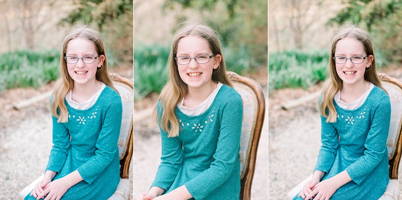
Remember: FILM IN THE MIDDLE.
Kindred on the left, Noble on the right.
First up – This is one where Kindred (on the left) almost worked for me. But then I saw Noble (on the right) and realized Kindred skin tones actually didn’t match at all.
The following ring shot blew my mind. Film (in the middle) is FAR superior to my digital. But the kindred edit (left)? Do you see how WASHED OUT it is? At least the Noble edit (right) retains the green color somewhat. Film is the real winner here.
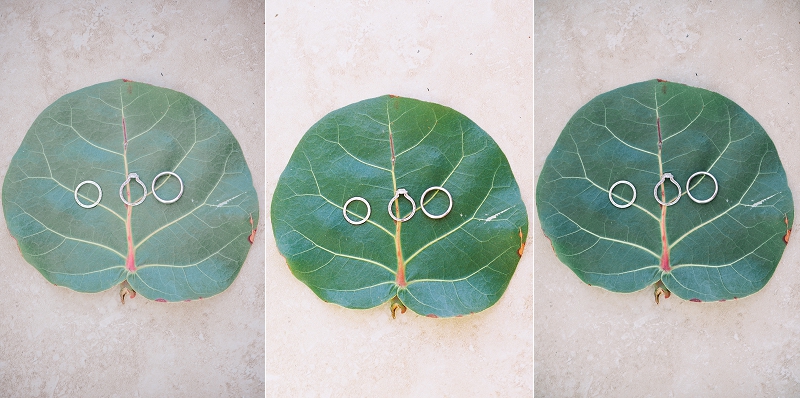
Don’t forget: Kindred, Film, Noble
In the next two examples, you can see that Kindred (left) adds a lot of Magenta tones. The Noble (right) edit isn’t super great either, though. These ones were tricky.


Kindred, Film, Noble
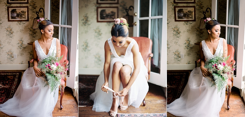

This next one? NOBLE (right) IS SO GOOD!!

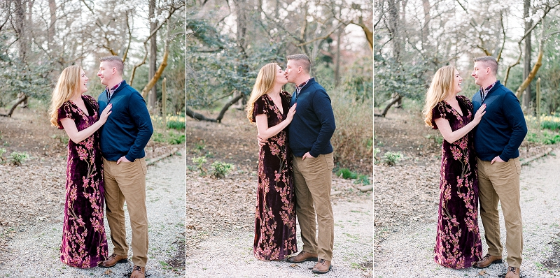


Look at the blue of her shirt in this one. Kindred (left) doesn’t match at all! Noble (right) matches much closer.
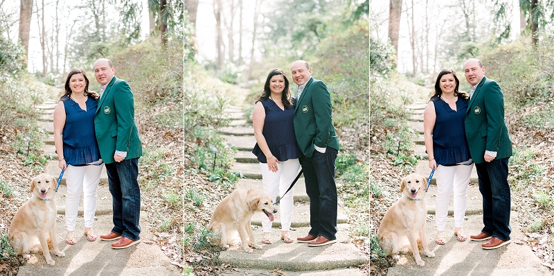
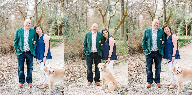
Now, look at the tones of the red flowers. The film (center) is actually still a subdued red, but Kindred (left) makes it look very pink.
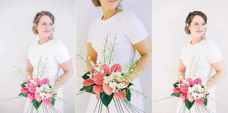
Kindred (left) – the blue is totally different than the dark blue that film captures!


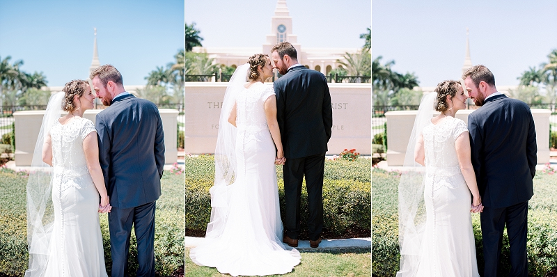
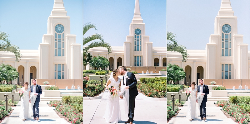

Noble (right) isn’t as yellow as the film (middle) but it’s closer than the Kindred. Kindred (left) again has more magenta tones in the skin.
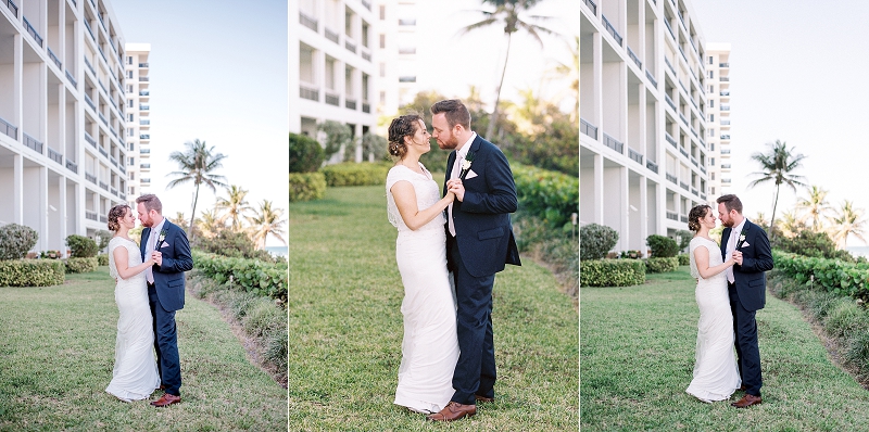
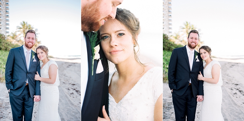
I really do love the look of Kindred! If I weren’t trying to incorporate more film into my workflow then I would stay with Kindred and be happy with it. But I think that Noble, while not perfect, is definitely closer to film than Kindred offers. It gives me hope that my digitals can more closely match my film!
So what do you think? Do you use either of these presets? Would love to hear your thoughts!
Click here for more Film Versus Digital Comparisons



add a comment
+ COMMENTS